The Toras Story
Designed by Suresh Gopu over a sustained development period of twelve months, Toras answers an important typographic question, ‘with the increasing pace of life, shorter attention spans and the huge practical and cultural impact of technology, how should typography for wayfinding look?’
The small clutch of tried and tested fonts in this discipline are serviceable, but their over-familiarity means that they no longer feel contemporary and relevant. Much of their personality has been lost through assimilation - they have become purely functional. And what’s more, the parameters of that function are changing fast.
There’s an argument that personality has no real place in typography for wayfinding and signage. However, research suggests that, although functionality is the key priority, a lack of character is likely to subliminally disengage the reader and functionally compromise the attention the information receives. And, is there truly such a thing as a font that is merely functional?
Of course, fonts designed for this purpose always have a much greater life outside the arena for which they were designed. Frutiger, still the most ubiquitous font in airport and transport signage was commissioned in 1968 for Paris Charles de Gaulle Airport. But, of course, it has enjoyed huge success outside its intended use because it is simply a perfectly designed humanist sans-serif with, arguably, a good deal more unique character than the perfectly functional Univers that it replaced.
So, Stuart’s ambition for Toras, was to analyse the specific requirements of wayfinding for a contemporary world - with the pace and volume of traffic and the technological changes that have altered the way travellers now see and absorb information. The font’s unique character would be driven by its functional specifics, coupled with a distinct personality that would stem from Fontsmith’s philosophical outlook and their particular sensibilities.
Stuart looked at typical legibility issues and commonly mis-read glyph combinations by testing with things like blur and sharp angle views. This revealed key issues that then informed some of the key glyphs in the character set. He discovered that the sharp angles in characters like the cap ‘A, W and M’ bunched-up visually, compromising legibility at distances and in situations with restricted view. This led to a decision that significantly informed the look of the font. The new font had to be opened-up across the board, whilst keeping the overall line length the same, or shorter than its predecessors.
This and other key challenges risked driving the entire direction of the font towards the merely functional. In an effort to ensure he had the creative freedom to design a font that would also have relevance outside the context for which it was designed, Stuart turned for inspiration to the words of Matthew Carter and his creative philosophy and a working method when he had similar restrictions designing the Microsoft screen font Verdana. ‘Design from the inside out’ was the mantra that helped him keep the process on track. This meant working on the core visual idea and fundamental personality of the font first, so that it was robust enough to survive the rigours that functional expediency would exert on it. Using this mantra, Stuart concentrated on what were the ultimate important parameters before adding design nuances and detail to make something beautiful as well as functional.
The result is a font with its own, particular beauty. It flows exquisitely, is defiantly human and, as for personality, it’s brimming with it. But fundamentally, its real power lies in its utterly unbreakable legibility. Researched extensively, Toras has been expertly crafted and developed for its pure clarity.
Case Study
Case Study-CTS
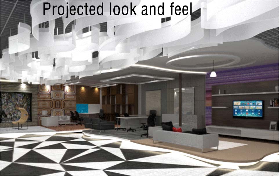
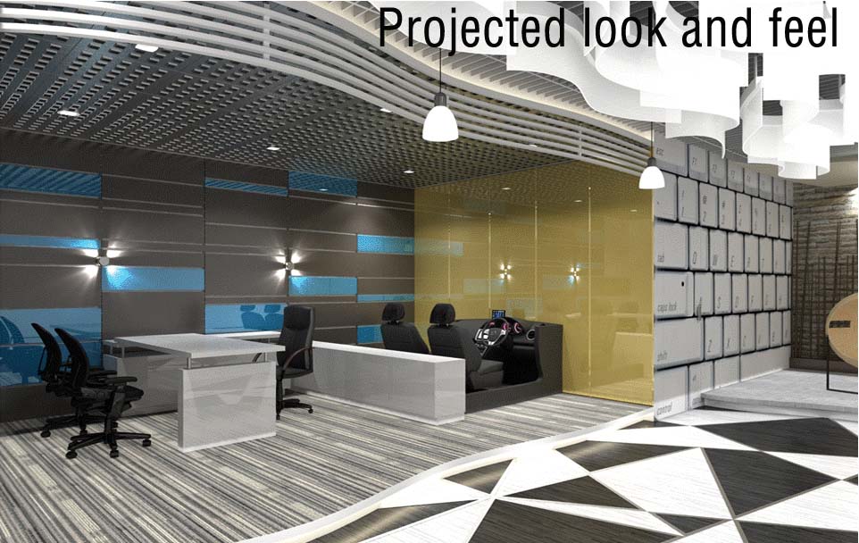
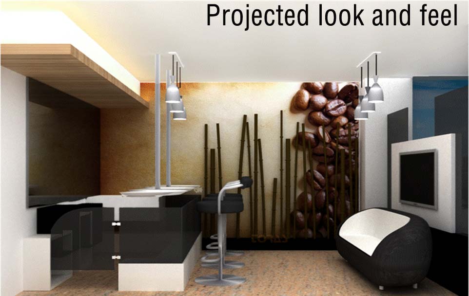
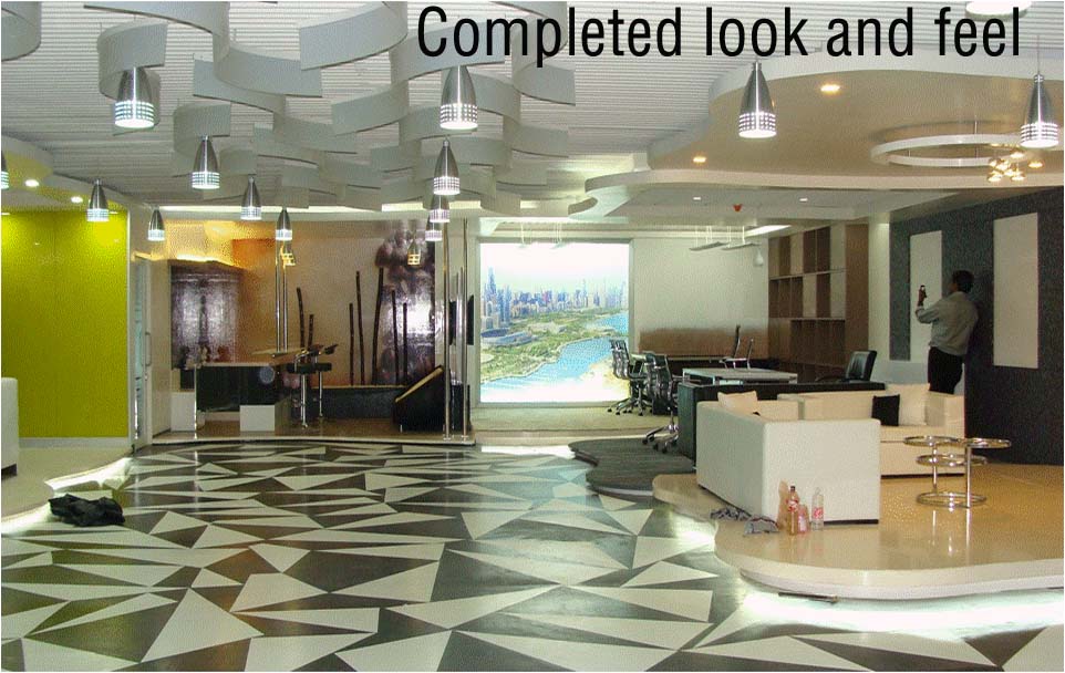
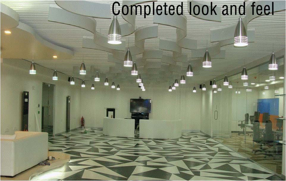
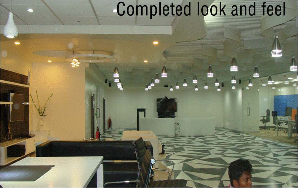
Insurance Experience Zone
- Branded Experience Next.
Concept Created
- -Brain storming with the client project team.
- -Intent to show case how will the insurance segment work in the future, with the help of technology from CTS
- -To be show cased to the Insurance segment clients of CTS.
- -To be Futuristic in design.
Projected
Projected
Projected
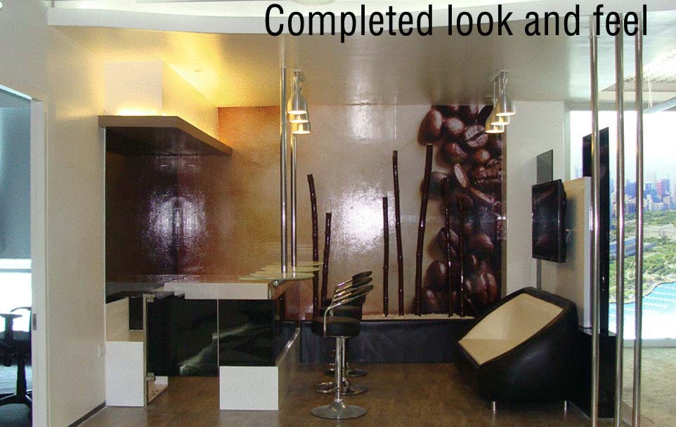
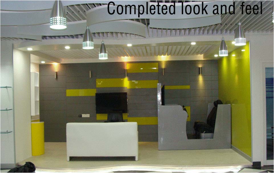
Completed
Completed
Completed
Completed
Completed
Case Study
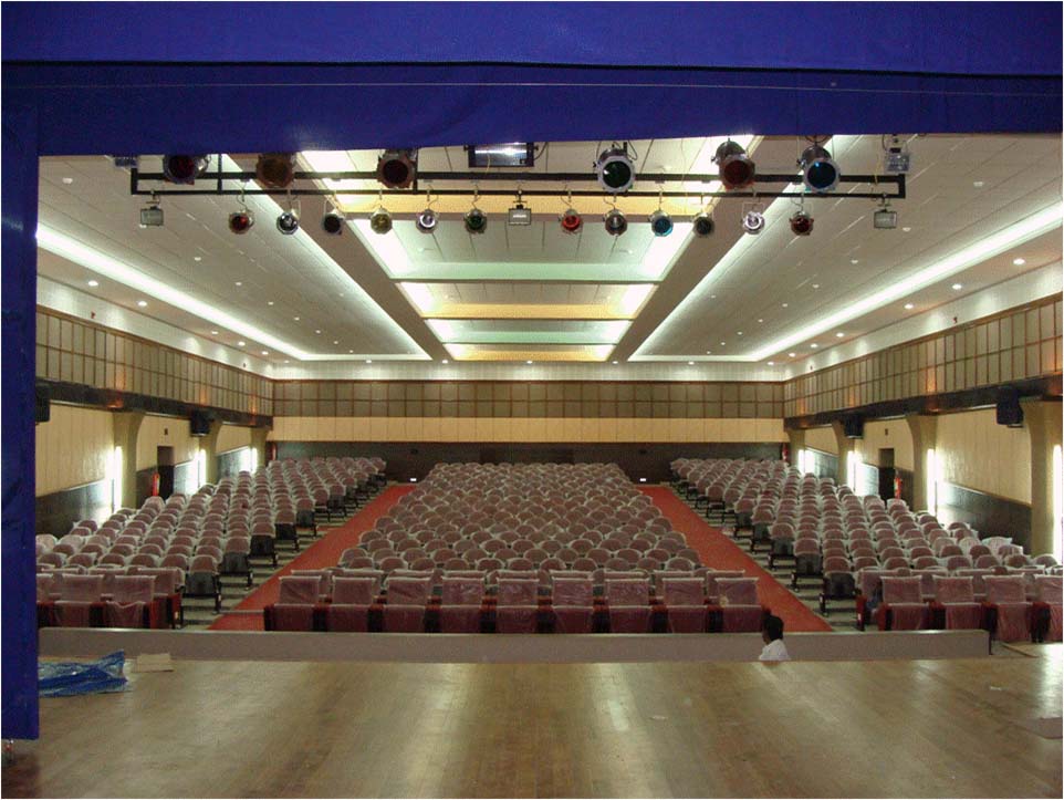
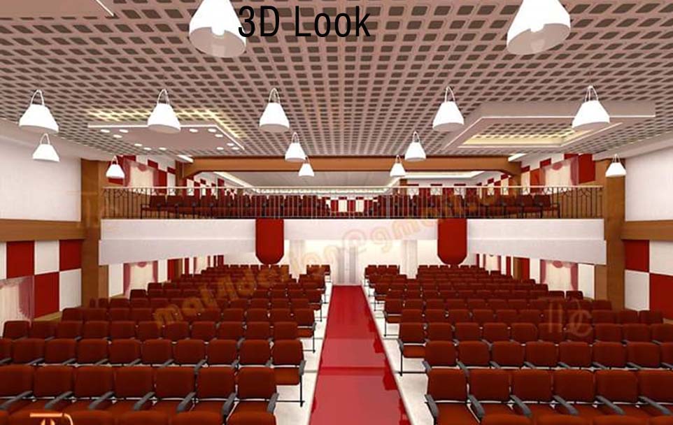
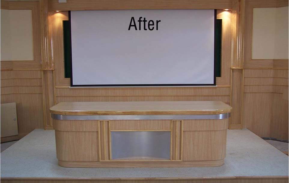
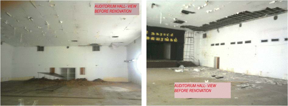
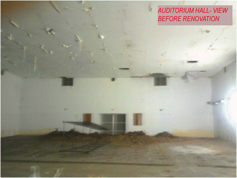
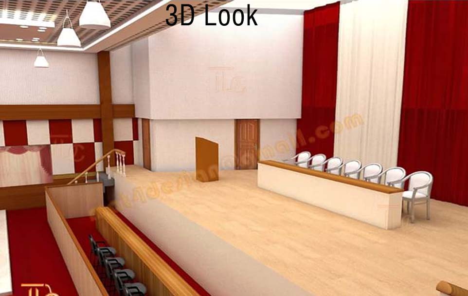
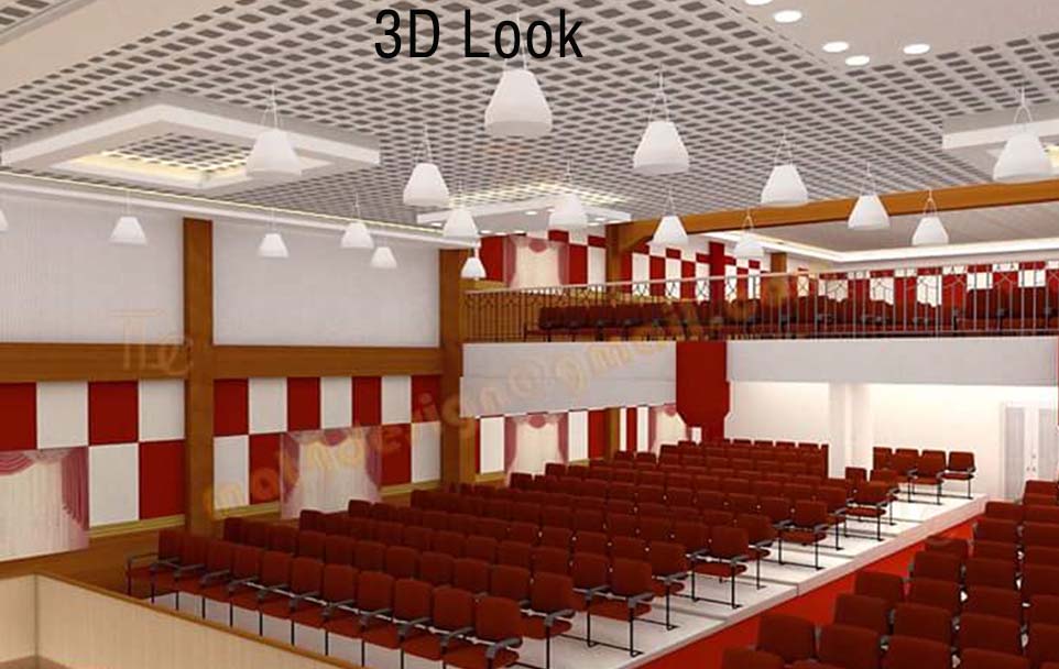
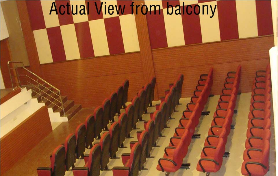
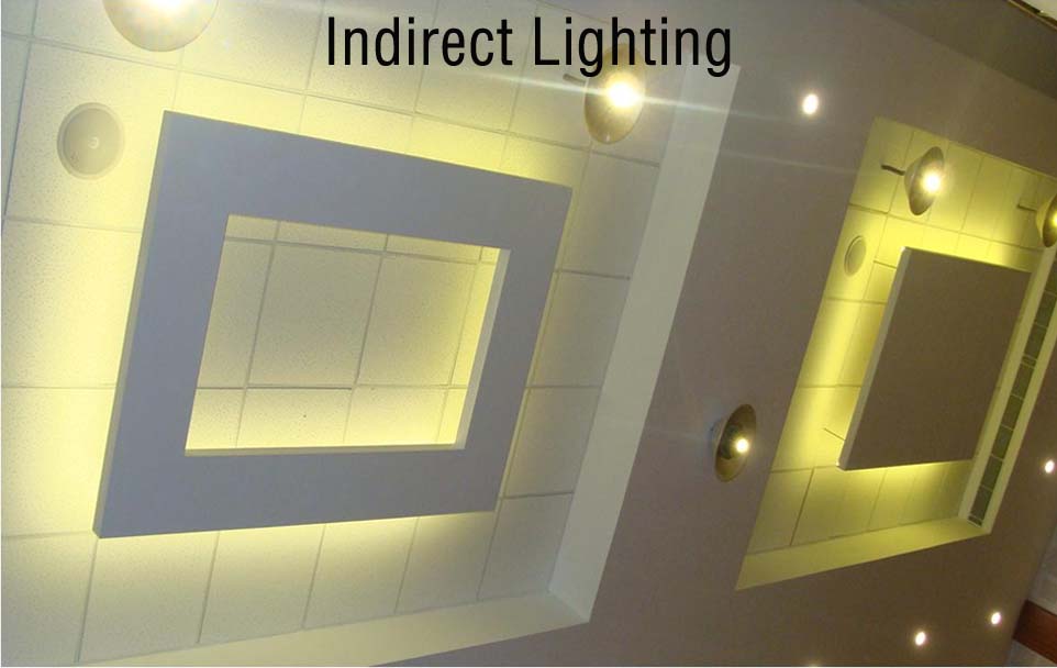
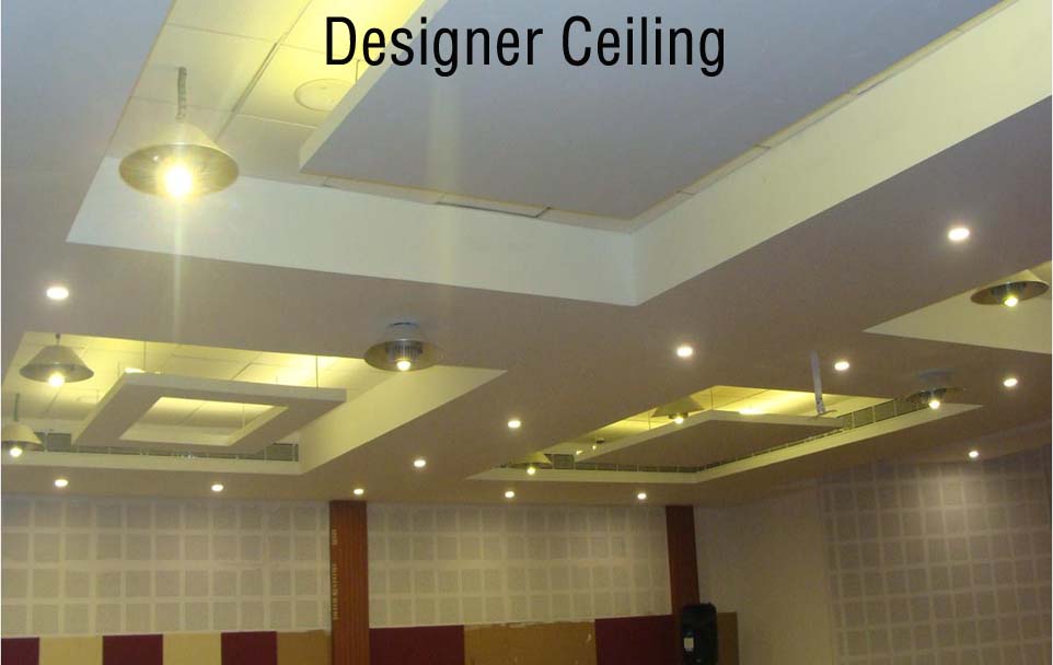
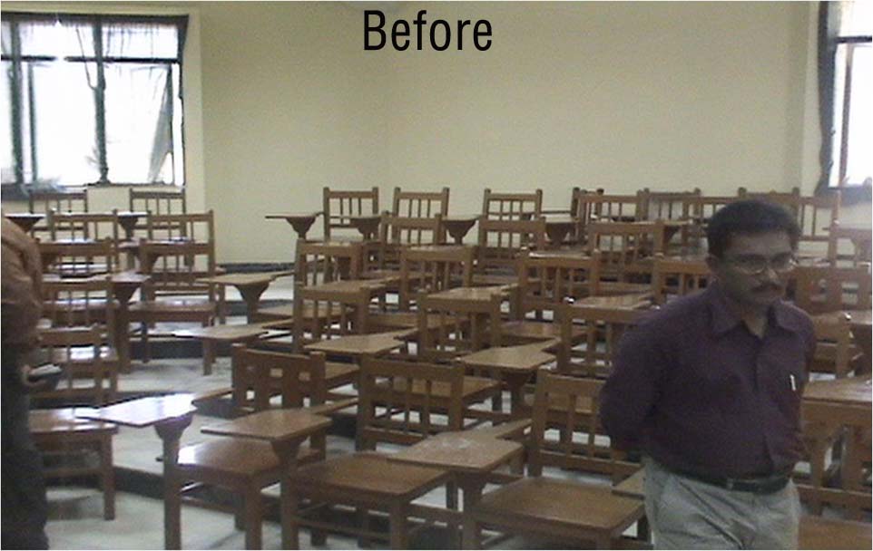
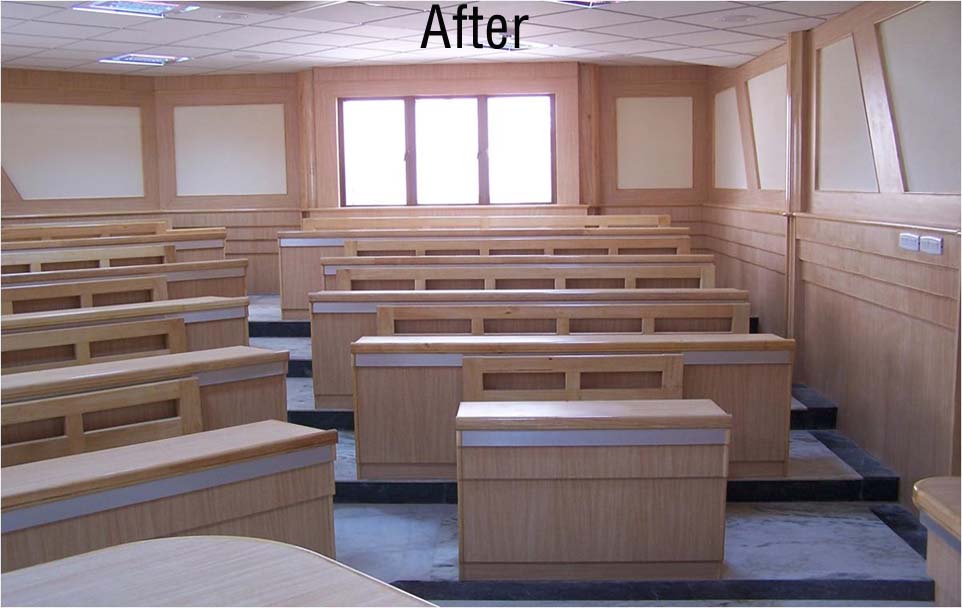
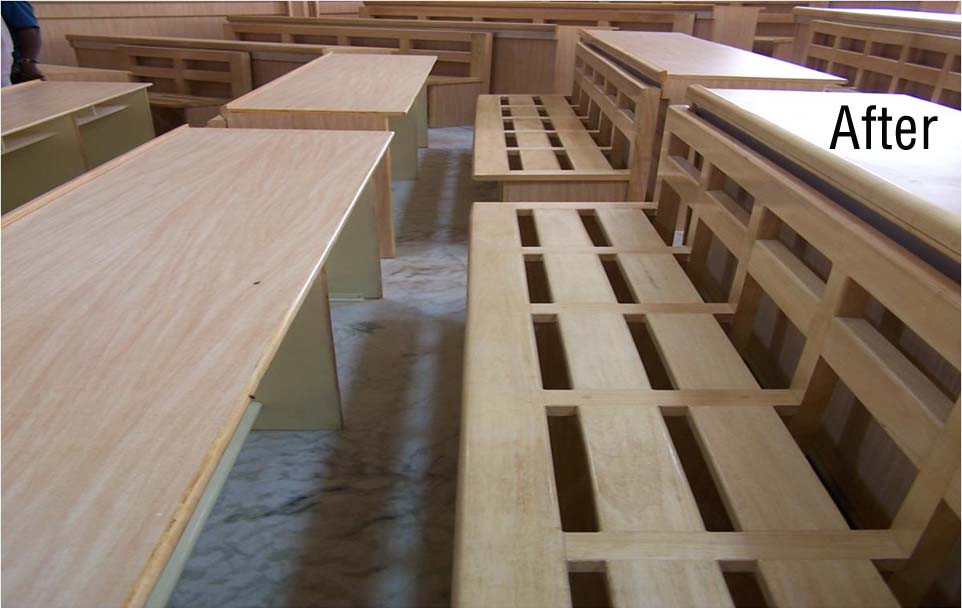
Meenakshi Ammal Dental College – Lecture Theatres
To renovate the old modeled lecture theatres to world class standard
Concept Created
- -Brain storming with the client project team.
- -World class with user friendly equipment.
- -Approved and appreciated by MCI.
Layout
Layout
Completed
Completed
Case Study
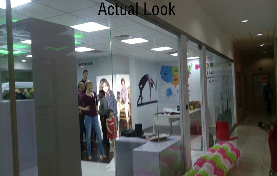
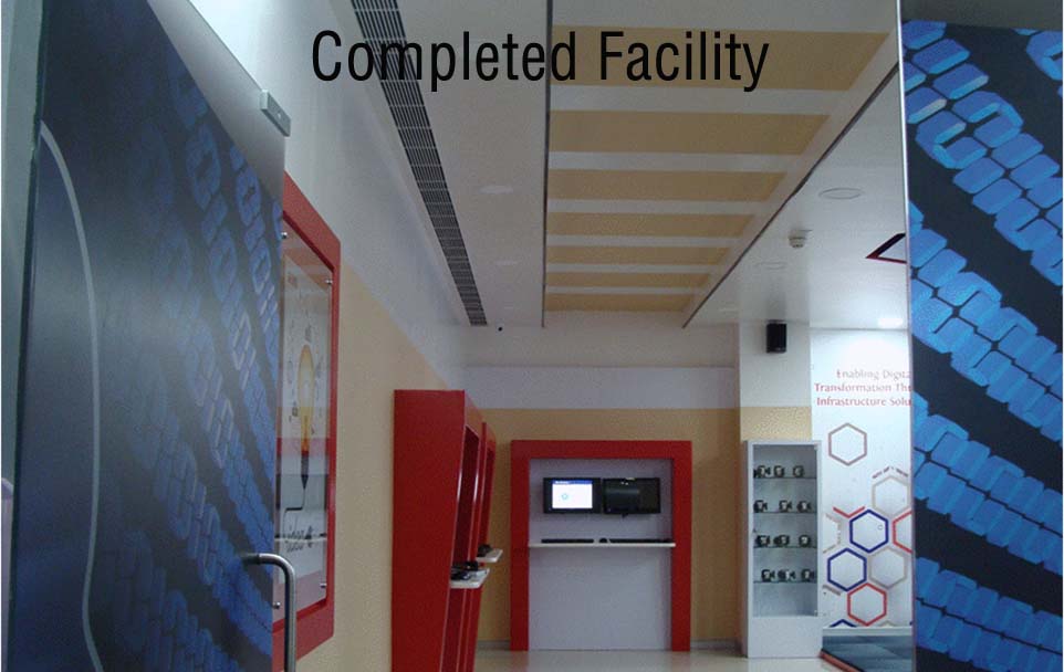
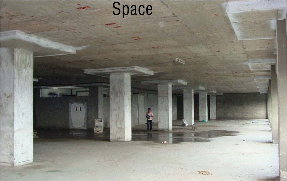
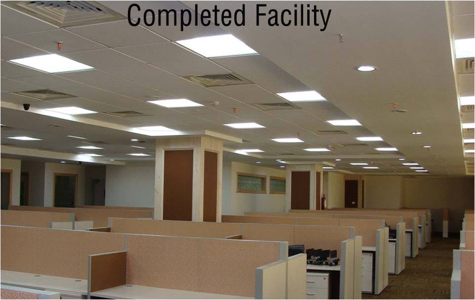
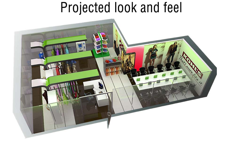
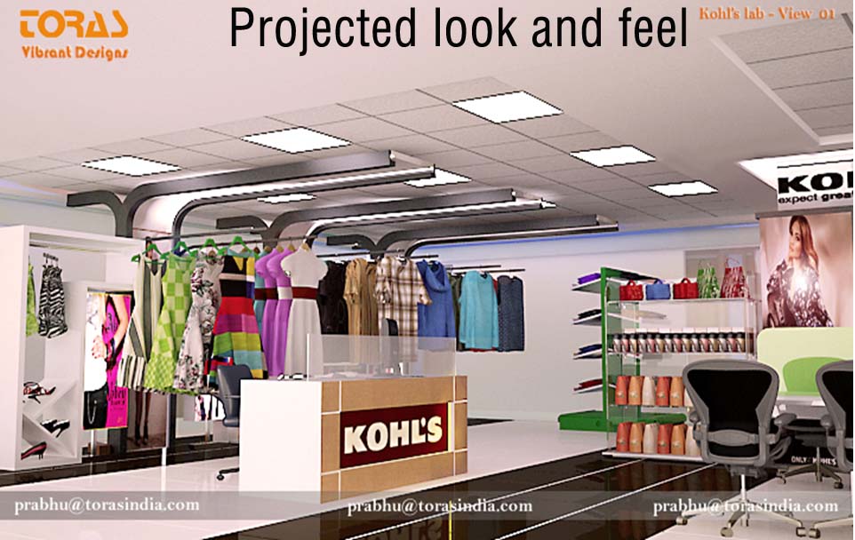
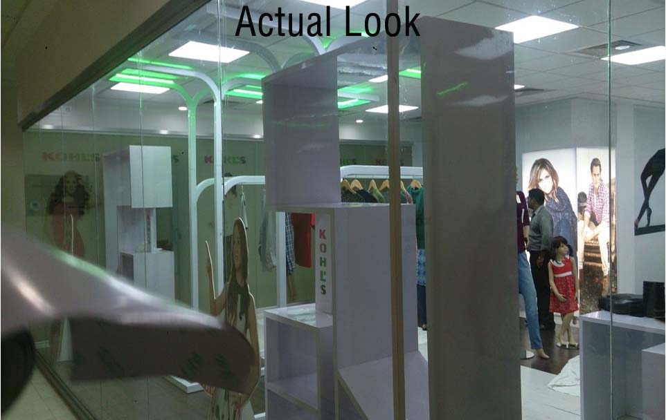
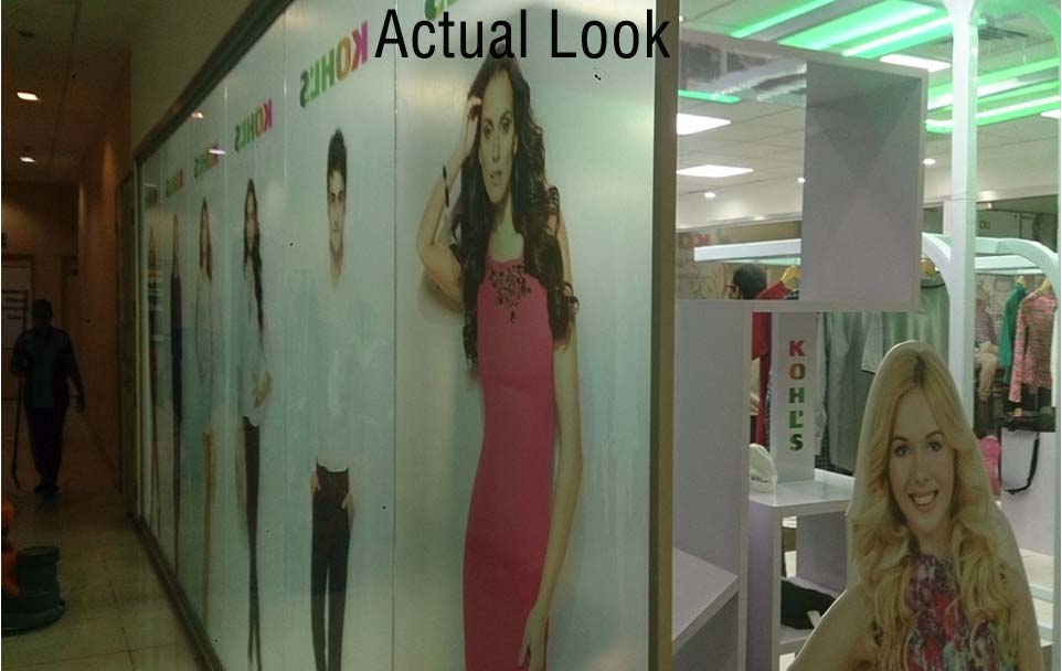
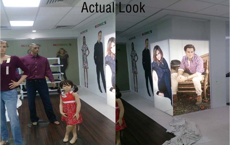
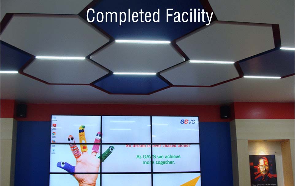
Creating an experience centre
- -Concept Created.
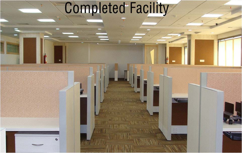
- -Completed the facility in 15 days.
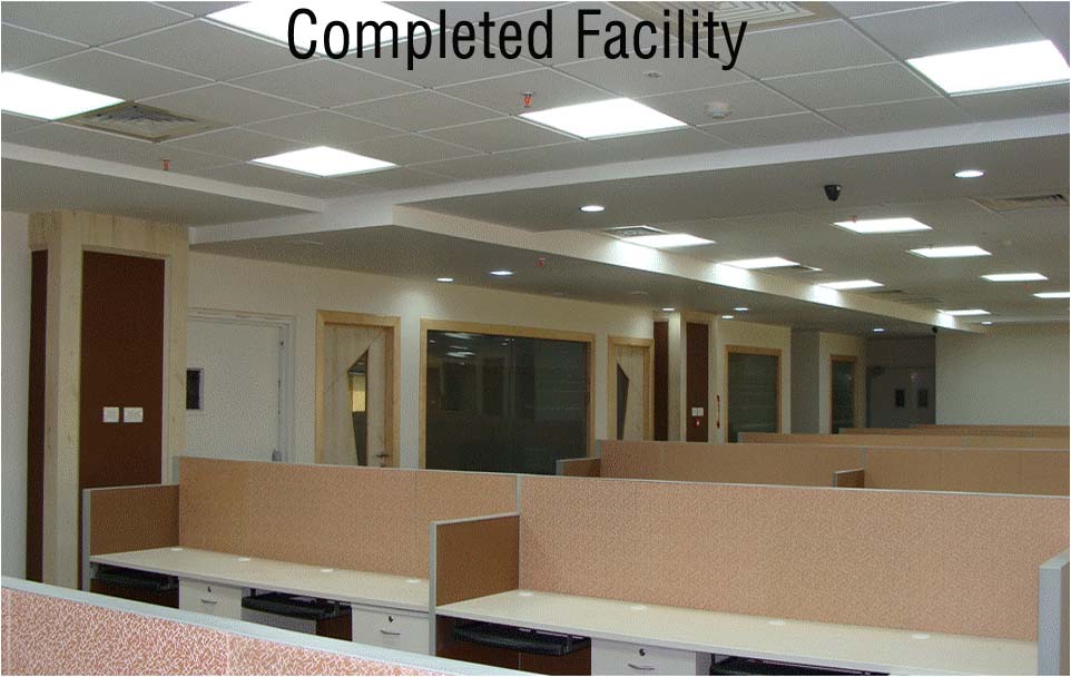
Completed Facility
Completed Facility
